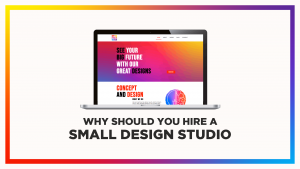
Best color combinations to make brand shine

6th July 2021

In our previous blog, we talked about the color psychology of different colors and their impact on emotions. In today’s blog you will be reading about the best color combinations which can be used together in logos, website, packaging and promotional designs. In order to grab attention of customers, we recommend choosing the combination of maximum 3(three) colors, that matches your brand identity. Explore these industry standard combinations and find your best combination.

Colors are based on human perceptions and can be categorized in three major groups:
Primary colors (red, yellow, blue)
Secondary colors (mix of primary colors- green, orange)
Tertiary colors (mix of primary and secondary colors)

“Colors, like features, follow the changes of the emotions.” – Pablo Picasso

A study by Colorcom shows- 62-90% subconscious judgements are based on color alone”

According to Pantone, Ultimate gray and Illuminating yellow has been chosen as the color of the year 2021. The colors best express the mood, how two different elements with independent characters support one another. Illuminating yellow at one side expressing the practical approach, and Ultimate Gray being rock solid, but are warming and optimistic at the same time.

It’s time to understand the combinations that goes well with the colors of the year 2021.

1. Modernized juicy colors - Pantone Inspired

The takeboost website uses bright blue in bits to denote their health care product, while orange steals the attention, creating a sense of juicy hunger.

Website: takeboost.com

Illuminating Yellow

Tangerine Tango

Ultimate Gray

Turquoise

2. Soft pastel stories

Pastels add values (such as the pastel pink and lavender) give cool colors, a tone of calmness and can be used in skin care and beauty.

Mandys Pink

Serenity

Pink noise

sand dollar

3. Neon party colors

The color palette is fun, full of life and young. It would be great for a site aimed at sports or artistic pursuits

Bio lime

knockout pink

bright yellow

purple rain

4. LGBTQ Inspired combos

The LGBTQ inspired colors have their emotional impact which changes the action skills with the minimal change of tones and shades.

Fiery Red

Emerald

Brazen Blue

Apricot

5. Indo-Western schemes

The palette feels traditional (think of festive celebrations of India) while also feeling a glimpse of the westernised world.

dandelion

Nighttime Blue

Bacon Pink

Ultimate Grey

6. Ethnic contemporary world

The tones of ethnic contemporary world resemble cultural, heritage and historical touch shown in the best way in the mythbusterchallenge website.

Illuminating

Cerise

Pool Blue

Ultimate Grey

7. 90' back to 2021 colors

The warm toned palette on the Chandon Garden’s home page generates energy and the vibe of nostalgia that a cool color palette would not create

Ochre

Orange Pepper

Golden Egg

Umber

The relationship and bond between color tones is the most important part of a good design. The right palette promotes people to take actions on the website or buy the product the brand wants to sell to them, while the wrong shade and tones can turn back the customers before they plan for any action.

Choosing the roght palette is a combination of creative and scienctific theories. When it comes to deciding the palette, the intial colors can go as per the designers instincts based on the research and later can be tested and reworked to suite the best of the purpose out of it.

Related blogs...

Leave a Reply

Your email address will not be published. Required fields are marked *