The importance of Minimalism “Less is more” design trend, learn from experts
19th june 2021
“MINIMALISM” a very commonly heard word by most brands. They often say, “We follow the concept of Minimalism“, but what is it?
Minimalism is a concept of focusing on important things and removing not-so-important things. This is nothing new, the term came into existence in the ’50s and 60’s when music, art, and design came in trend.
When we think of minimalism, we think of the design movements that started in the 1960’s – The Bauhaus design or The Ludwig Mies Van Der Rohe. It’s the same concept taken by the big brands like apple and google, to make their design minimalistic. Nowadays, it’s taking shapes in products to simplify the process and give more attention to simplicity and cleanliness.
“Simplicity is the ultimate sophistication.”
– Leonardo da Vinci, 1452
Learn from Industry experts
1. Google
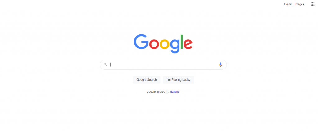
One of the most popular sites in the world is Google that has shown the best example of minimalistic design. The homepage is a kit of only necessary tools for the search engine. It has a flat simplified logo in the centre as a focus point and search bar to search bar.
“Perfection is achieved, not when there is nothing more to add, but when there is nothing left to take away.”
– Antoine de Saint-Exupery, 1900
2. Brevan Howard
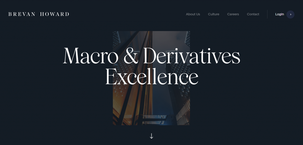
Brevan Howards is one of the best examples of Minimalistic design. There is a lot of empty space on the pages, creating a balance between the text, images, and graphic elements, maintaining the monotonous vibe of the website and the brand.
The combination of Fonts is experimental with the mix and match of Serif and San serif fonts across the website, with no more than 3 colors used at a time, giving the website a more calmed down effect and weightless. The buttons are placed only at required places while avoiding the additional elements, it avoids the viewers getting lost, which also means the website is designed with a user-friendly approach and with less hidden navigation.
3. Nike
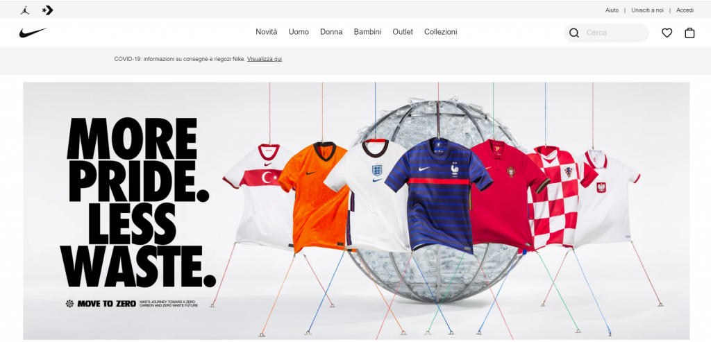
It is one of the most popular sportswear brands. The website of Nike looks pretty clean and sophisticated. It showcases to-the-point navigation between the categories. When we talk about the colors, it uses multiple color themes creatively used and positioned according to the brand identity and color psychology, while avoiding extra elements which make the website an example of a minimalistic design.
The Minimalistic approach for web design
To follow minimalism, brands tend to favor designs that focus on necessary components in choosing the theme and a complete aesthetic look. The main idea is to avoid irreverent elements, that don’t contribute to the purpose of the design.
Japanese graphic and web designs are the major followers of the minimalistic approach and emphasize the pastel colors, design choices that promote functionality and a sense of calmness.
Any intelligent fool can make things bigger, more complex, and more violent. It takes a touch of genius – and a lot of courage – to move in the opposite direction.”
– E.F. Schumacher, 1911
Tips and tricks to follow "Less is More":
- Follow the flat design approach that aims at functionality and usability
- Ensure your site is easy to navigate
- Use simple and powerful composition of images
- Have clean look, use white space strategically, and keep the edges crisp.
- Keep a balance between open space, and content.
- Create easy to read website content.
- Select limited colors, monochromatic shades, or vivid colors
- Maximum 3 fonts, as each typeface has its mood and emotions.
- Choose clean readable fonts like serif typefaces
- Avoid excess details: color transitions, shadows, and textures
Common Misconceptions of minimalism:
INFORMATION
Misconception
Cannot put-in all the information
Real concept of minimalism
Change the way of presenting
COLORS
Misconception
Black and white only
Real concept of minimalism
Combination of right and bright colors can also make a change like the website of Gucci
Font
Misconception
Small characters work best
Real concept of minimalism
Combination of 2-3 fonts, bold fonts if used correctly can also make a difference.
Benefits of following Minimalism approach:
- It makes the navigation easy making the final conversions faster.
- It is easy to make a website and application responsive.
- It enables faster website loading
- It helps the user to focus on the main content (products/services).
- The foremost important factor is, the user doesn’t get lost on their search process, but a minimally designed website/application allows the user to navigate easily and in return make the final purchase faster.`
Related blogs...
Why should you hire a small design studio?
Why should you hire a small design studio? 17th August...
Read MoreWhy every company needs a website? Best strategies that work to earn money in 2021
WHY EVERY company need a website? Best strategies that work...
Read MoreBest color combinations to make brand shine
Best color combinations to make brand shine 6th July 2021...
Read MoreOur guide to colors and emotions for brand building
Our guide to colors and emotions for Brand building 19th...
Read More